Contrast and Saturation Basics

When you first open a properly exposed Raw image, it usually looks flat and lacks punch. It’s nothing at all like you saw when you clicked the shutter. That image now requires processing in Photoshop’s Adobe Camera Raw (ACR), Lightroom, or the Raw converter of your choice. You can, and should, adjust the exposure, set the global white balance, capture sharpen, handle noise, etc., in ACR or its equivalent, but a discussion of Raw processing will be for future posts. For now, in general, just make sure you leave some room at the dark and light ends of the histogram, if possible, and leave the image a little flat to open in Photoshop. It’s always easier to add than to remove contrast and saturation in your final Master image.

So, what is the difference between contrast and saturation, and how do you add one, the other, or both?

Contrast is the difference between light and dark tones. You can also think of it as the separation between the shadows and highlights. An image with low contrast is said to look flat or dull, while high contrast makes an image look punchy or “contrasty”.

Saturation is the depth or intensity of the color. The lower the saturation, the less intense are the colors. They can look weak and pale. If you fully “desaturate” the colors, you end up with a monochrome, or black & white, image. On the other hand, if you increase saturation too high, the colors can become “oversaturated” and look unnatural.

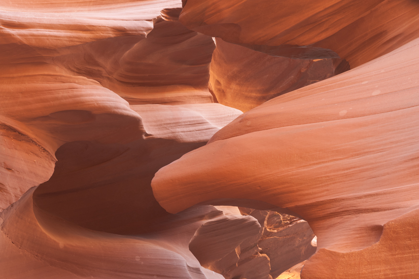
To illustrate the effects, let’s use an example from Antelope Canyon. As you may know, Antelope Canyon was created by erosion of the Navajo Sandstone. As sunlight streams in from the top, it both reflects and directly illuminates the intricate walls and surfaces in the narrow canyon. With your camera’s white balance set on Auto, the prevalent orange hue becomes sort of a grayish orange in the Raw image.

We’ll start with the unprocessed Raw image, shown below. As you can see, it’s rather flat and dull.

Continue reading

Using a Focusing Cloth

At a workshop in Redwood National and State Parks back in 2003, Jack Dykinga gave me one of the best pieces of advice I’ve ever received for getting better images in the field: Use a focusing cloth. It was simple, had been around just about as long as photography itself, yet was rarely used by anyone but large format shooters. I adopted it back then for use with my DSLR, and have been using it ever since. For me, it has become as essential as my tripod and cable release.

It helps me compose and focus, both physically and mentally. With it, I can easily see anything on my LCD, regardless of the ambient light. It helps keep wind, sprinkles, and even flying bugs out of my eyes while I’m shooting, helping me concentrate on my subject. With it, it’s much easier for me to check the corners and edges of my frame, and to look for merges throughout the image. It even allows me to use the Depth of Field preview function, regardless of how dark the image becomes when I push the button!

It’s become so important to me, that I bring a spare when I travel in case something happens to the first one in the field. And as a final bonus, many of my shooting buddies have encouraged me to use it all the time—even when I’m not shooting. They say it’s a fantastic fashion accessory that looks great over me.

My original focusing cloth, also known as a dark cloth, was a 36″x48″ Toyo-View focusing cloth that I got from B&H. After using it for a few years, I wanted something waterproof, breathable, darker, and more versatile. Besides, B&H no longer carried the Toyo-View cloth. After six months of testing various combinations of fabrics and Velcro placements, I now use my own Tom Vadnais Photography 36″x48″ waterproof focusing cloth. It’s an improved design that’s handmade right here in the USA, and is available only from me. Please e-mail me at tom@tomvadnais.com if you’re interested in ordering one directly (US$84 + US$5 shipping and handling to a US address). It’s black on the inside, to give you a dark area to shoot from, and white on the outside to reflect heat. There are strips of Velcro on both sides of one end that cinch the cloth around your lens, making it fast and easy to attach and remove when changing lenses in the field.

Focusing Cloth in the Field

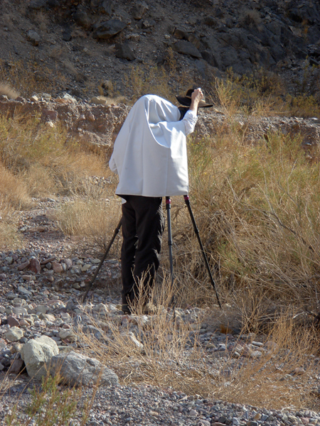
After wrapping one end around your lens, the rest of the cloth simply drapes over your camera, your head and shoulders, and partially down your back. This eliminates most of the stray light around you, allowing you to see much better through your viewfinder. You can’t believe how much easier it is to concentrate on your composition and focusing when surrounded by relative darkness. It also allows you to see everything on your LCD, even in the brightest sunlight.

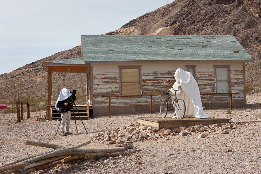
As you can see from the photograph below, it can also help you blend in with any ghosts you may encounter when out shooting.

Focusing Cloth and Ghost

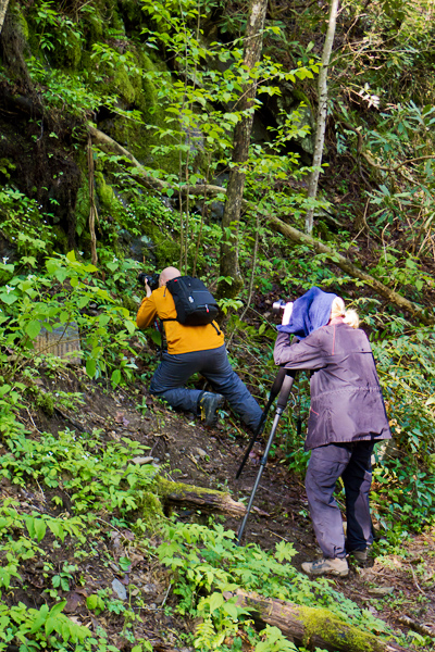
Now, do you have to spend US$84 on a commercially available waterproof dark cloth with Velcro. Of course you do—-if it’s one from me! Not really. A US$5 black bath towel from a discount store works just fine. You can drape the towel over your lens, camera, and head, as my friend Sue is doing during a workshop in the Smokies. (Her towel is dark blue, but is still effective. In general, though, you want a black cloth or towel, so you don’t have any visual color contamination while you’re shooting under it.)

Sue with Dark Towel

Like any other new tool in photography, using a dark cloth takes a little getting used to at first. Think back to when you first used a tripod, remote release, or any filters. But almost right away, you’ll likely find the benefits so outweigh any learning curve that you’ll adopt it full time. I did.

NANPA Everglades Regional Event

I am honored to have been asked to join four other professional nature photographers (including my friend Bill Lea—who’s writing a book about the Everglades) for a NANPA (North American Nature Photography Association) photo adventure featuring five field trips in Everglades National Park. There will be both morning and evening shoots on Friday and Saturday, and a morning shoot on Sunday, all during the prime light hours. Critiques and Q&A sessions with the pros will be held midday at the hotel. The event will end with a farewell brunch on Sunday. It should be a fun, action-packed long weekend of shooting and image critiques.

Dates: Thursday, Feb. 23 through Sunday, Feb. 26, 2012

Cost: Members $345/Non-Members $445 (see registration form for other options)

Location: Florida Everglades, Florida City, FL

Last Date to Register: Wednesday, Feb. 12, 2012

Maximum Number of Attendees: 60

For schedule and to register, please check out www.nanpa.org/2012everglades

Why I Use Manual Exposure Mode

Choice of exposure mode always seems to generate a spirited discussion among photographers. Here’s my 2¢ about it. Actually, it’s a long post (probably more like 4 or 5¢), so you might want to grab your favorite beverage before settling down in the warm glow of your monitor.

If you’re serious about your photography, you’ll need to use Program, Aperture Priority, Shutter Priority, or Manual exposure mode. Neither a fully Automatic mode nor any of the “Scene” modes found on many DSLRs allows you to override what the camera chooses for you.

A camera’s meter is designed to determine the exposure that renders the scene as a mid-tone. But the actual scene may require a darker or lighter exposure than that.

As with any other element of your photography, the correct exposure for a particular image is the one that shows the scene as you intended. This might be, and often is, different from what the camera meter indicates.

Shutter Priority, Aperture Priority, and Program are known as automatic modes because the camera automatically sets the aperture, shutter speed, or both, respectively, based on the camera’s meter reading. In Manual mode, you set both the aperture and shutter speed, using the camera’s meter as a starting point.

You can successfully use any of these modes (why else would they be there?), but it’s worth finding one or more you are most comfortable with. I exclusively use Manual mode. I find it the easiest and most consistent for the kinds of photography I do. But I hope this discussion helps you choose the one that works best for you.

Fredo in Office

By the way, this image has nothing to do with this article. But a picture of my best furry friend Fredo sure makes this a much more attractive post, doesn’t it? Continue reading

It’s Okay to Crop – Sometimes

I can hear several of my friends laughing even before reading the rest of this. After years of my staunch (they might say unreasonably stubborn) aversion to cropping, they’ve prodded me to realize that the camera’s default image shape doesn’t always result in the best image.

It’s still my preference to get everything just the way I want it in the camera, especially with landscape images. But now, I’ve come to appreciate the benefits of the occasional crop.

Sometimes, you have to crop to fit certain requirements for a website, client, contest, or publication. (Heck, even my header image on this site is cropped from a full frame.) Other times, a judicious crop just suits the image better than the camera’s default shape does.

Now this is not a license to “shoot loose, and crop later”! That’s lazy, sloppy, reduces the resolution of your images, and is bad practice.

Here’s an example of when cropping worked better than the default image shape. When she was a little puppy, my BFFFF (Best Furry Friend Forever, Fredo) came by my office for a visit. Well she didn’t come by on her own; her Mom brought her over.

Fredo Singing (full frame). Click on image to enlarge.

She was sitting in one of the conference room chairs while I was taking pictures of her. She was being so tolerant, it was time to reward her with another treat. I loved the expression on her face in this picture as she anticipated the treat. It looked like she was singing.

But as a rectangle, the photograph was cluttered and distracting. I knew a square crop would eliminate the distractions, focus the attention on Fredo, and makes it look more like she’s singing. I framed the image so there would be enough room around her so I could crop it square, yet still retain a sense of place by including recognizable portions of the chair and table. I also placed her to the left side in case the rectangular shape worked as well. It didn’t.

Fredo Singing (square crop). Click on image to enlarge.

One of my main influences for thinking in terms of the square image is my friend and mentor Charlie Waite. For most of his professional career, he made landscape images using a Hasselblad film camera, which yielded a square image. A square format image often tells a significantly different story than a rectangular one.

What I’ve learned is that cropping an image to improve its composition doesn’t necessarily mean the image was not composed well when the shutter was clicked. Sometimes, it’s just what you need to tell your story in the best way.

Maybe it’s just that a puppy taught an old dog new tricks.


Photograph Where You Live

As you know, it is essential to travel long distances, preferably to exotic locations, if you want to make interesting images.

Wait, maybe that isn’t really so.

No matter where you live, there are incredible shooting opportunities all around you. Continual shooting is one of the best ways for you to develop your photographic eye. (Reading photography resources and studying photographs and paintings by masters are two other important aides.)

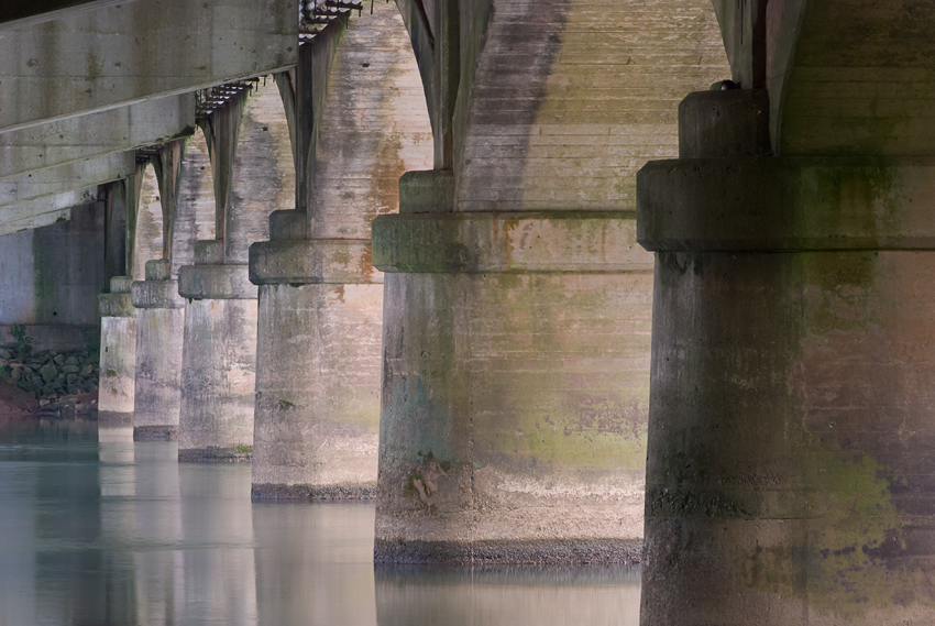
Roswell Road Bridge. Click on image to enlarge.

This image was made less than two miles from my house. I had driven over this bridge thousands of times before without ever noticing anything special about it.

One day, a friend and I decided to go out shooting, so we grabbed our cameras and tripods, and walked along a paved trail along the river. The path led under this all-too-familiar bridge. It was late afternoon, and the sun was starting to go down to the right in the image.

Our intention was to go past the bridge to another spot along the river edge. We never made it. We spent the next hour or so shooting various compositions, including horizontal (landscape) and vertical (portrait) orientations.

Then I turned around, and saw a totally different view. Sun was pouring through the drainage slot on the bridge, and illuminating a pile of rocks below. When I saw that light beam, I knew I was going to process it as a black & white image later.

Roswell Bridge B&W. Click on image to enlarge.

So in an hour, two miles from my house, under a bridge I had crossed thousands of times, I made two images that I liked. Funny thing is when I show them to people, and ask them to guess where there were made, I usually get somewhere in Spain or France as the reply. Of course, I always tell them they guessed right!

Not really. To me, the real story is even more surprising.

As examples of local things to shoot, my Five Mile Radius gallery has a number of images I’ve made within a five mile radius (as you might have guessed) of my house. I hope those images encourage you to get out with your camera and tripod, and explore where you live. Sort of like a traveling photographer who thinks your location is an exotic trip might do…

Chosing a Color Space

When converting a RAW image file (and you are shooting RAW, right?), you have a choice of color spaces and bit depths to work in. Unless you’re not going to do any post-processing, and are only making a JPEG, you should work in 16-bit. (Hmmmmm, this might be the subject of a future post. For now, just trust me.)

Just as strong a recommendation can be made for using the ProPhoto color space. When converting a RAW image, the most common color spaces used, from smallest to largest, are sRGB, Adobe RGB 1998, and ProPhoto. If you shoot RAW, your image doesn’t have a color space assigned until you process it in your RAW converter of choice. (Yes, even if you set your camera’s color space to sRGB or Adobe RGB 1998, that only applies to JPEGs. The RAW images won’t have any color space embedded.)

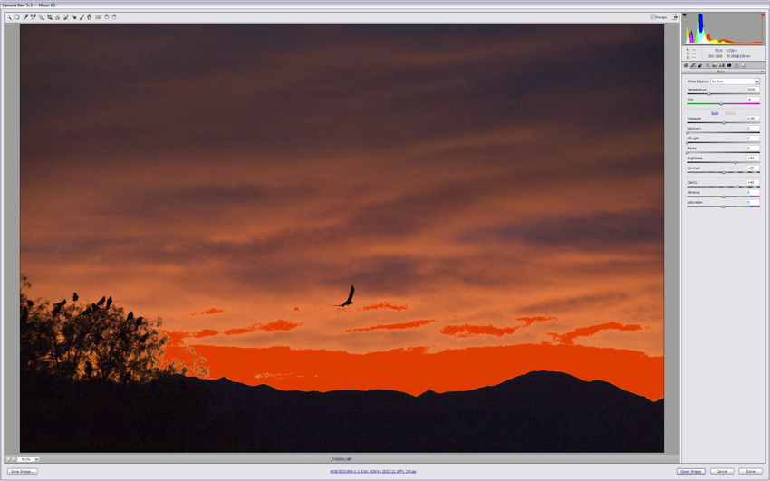
There are plenty of good technical explanations available on the web and in books to prove why this is so. But to save 3,000 words, here are three screen shots from Adobe Camera Raw (ACR) that should show the benefits of working in the largest space.

The first screen shot shows an image made at sunset, with an intense orange sky. When sRGB color space (the smallest) was chosen, a large area of bright red highlight warning dominates the image. (That bright red is the highlight warning in ACR; it’s not in the image itself.)

sRGB Color Space (8-bit). (Click on image to enlarge, then click again to scroll through all three.)

When Adobe RGB 1998 color space was chosen, the area with the highlight warning was greatly reduced. This is because it is a much larger color space than sRGB. (Bit depth and color space are independent, so either 8-bit or16-bit bit depths can be used with Adobe RGB 1998 without any effect on the gamut.)

Adobe RGB 1998 (8-bit). (Click on image to enlarge, then click again to scroll through all three.)

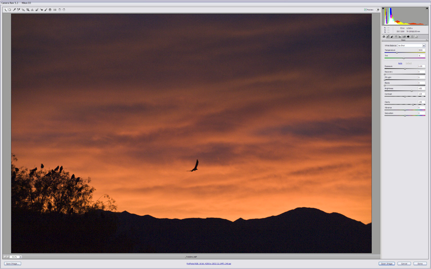
By converting the image to the largest color space, ProPhoto, there were no pixels in the highlight warning zone, so the red warning disappeared. (ProPhoto images should be in 16-bit.)

ProPhoto Color Space (16-bit). (Click on image to enlarge, then click again to scroll through all three.)

Converting your RAW images to ProPhoto and 16-bit will give you the most data possible to work with in Photoshop.

(Just remember: When you’ve finished all your adjustments and saved your Master File, you’ll have to flatten the image, convert to sRGB, and change the image mode to 8-bits if you intend to make a JPEG. More on that to come….)

So once again, bigger is better. As far as bit depth and color space go, that is.

Opposite Opinions, Same Image

When you see an image, you know if you like it or not, and will probably be able to describe why it affects you the way it does. Many of you have also likely had your images critiqued by a judge for a competition or by a pro during a workshop. Hopefully, any feedback you got was helpful, and allowed you to see any strengths or deficiencies in your image in a new way. But is it the “right” way?

White Sands, NM. (Click on image to enlarge.)

On two different occasions, I had two pros critique the White Sands image above, and got polar opposite responses. At a camera club competition, pro Craig Tanner said he loved how the story of the dune field was told in a single image, and how the different series of curves in the dunes, in the dune tracks, and in the clouds made a dynamic composition. It kept your eye moving around the image taking in all the elements of the scene. He gave it Second place in the Color Print category.

When my friend and mentor British landscape master Charlie Waite critiqued this image during one of his Master Classes, I had to double-check to make sure he wasn’t talking about another image. He wasn’t.

Charlie said it was a jumbled mess, with three unrelated stories mashed into a single frame. There were the graceful ripples and curves of the dunes at the lower left clashing with the discolored, harder-edged dune tracks with scrub bushes scattered about on the right. And that sky! Just too many unrelated shapes and textures to make a cohesive image.

Not only were they commenting on the same image, it was on the identical print, so there was no variation there, either. So, who’s right?

They both are, of course. Each viewed the image from his own unique perspective. Each had, and had clearly expressed, very valid points about the image.

If we’re smart as photographers, we will consider all constructive criticism when evaluating our own images. We might then see ways to improve our images that we missed on our own. But we won’t make changes just to please the critics. As this example shows, we can’t please them all anyway, even if we tried.

The moral: Ask as many friends and pros as you can to critique your images, but take their comments as suggestions, not gospel. There are no absolutes in photography. As Ansel Adams said, “There are no rules for good photographs, there are only good photographs.” And what constitutes a good photograph is in the eye of the beholder.

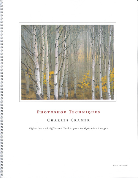
Best Photoshop Techniques workbook

Okay, here’s finally a link to the book you’ve heard me heartily recommend all these years. It is Charlie Cramer’s Photoshop Techniques workbook.

This is the best-written, most useful publication I’ve ever encountered regarding post-processing. Just imagine a Photoshop book that is actually fun to read, easy to understand, yet contains the essentials for getting the most out of your images. And it’s all done just using Photoshop. Don’t rely on plug-ins to make your post-processing decisions for you. Learn to use the versatile tools you’ve already paid for in Photoshop.

Not only will you learn how to optimize your image files, you will understand what you are doing and why you are doing it. You will learn to see what your images need, and how both global and local corrections can rearrange the light to more closely match the vision you had when you made the image in the field.

In addition to the magnificent workbook, Charlie includes a CD with the example images from the book with all the Layers included. Using that CD with the book will not only demonstrate the technique, but allows you to turn off the Layer, and try it for yourself, using the same image. You can then compare your version with Charlie’s. It’s an invaluable learning tool.

The workbook and CD are only $40, and are currently only available directly from Charlie. Please contact him at http://charlescramer.com/contact.html, and tell him I recommended his workbook to you. He will respond with how to make the payment. Before you know it, you will see a tremendous improvement in your images.

Make sure you check out Charlie’s work on his website at www.charlescramer.com.