
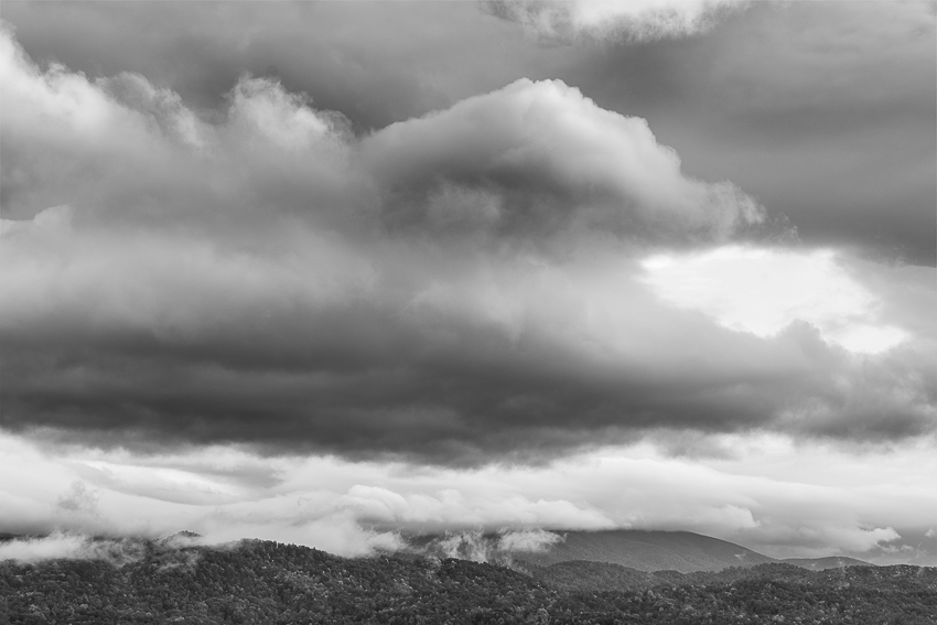
Foothills Parkway, Smokies. (ZEISS Otus 85mm f/1.4 on Nikon D810.)
Often, when I come back from a trip, I’m initially disappointed with the collection of images I made. Sure, I’ll have a couple I’ll send to friends to show where I’ve been shooting, but they’re not anything great. Later (and sometimes much later), I reluctantly look through them again, and am pleasantly surprised to find a couple, or even a few, images I really like. That’s always a fun discovery.
How about you? How many times have you gone back through your older, forgotten images and wondered why you hadn’t done anything with a specific image? Or, more poignantly, not only do you not remember making that image, but don’t even remember seeing an image like it before? Yet you made it!
Or how about the opposite effect? Several of my photo friends come back from a week shooting, and struggle for a few days to get down to their top 100 favorites from that trip. Ask them again in a couple months, and they’ll tell you they didn’t get anything at all from that very same trip!
What in the world is going on? That phenomenon is often called the recency effect. It can affect photographers in different ways—initially for good or bad. For some, their most recent images are all masterpieces, and they have a hard time choosing just a couple to show. But then, they lose interest in most of them. Others, like me, after an initial period of disappointment, find images they come to really like out of what seemed like a batch of rejects.
This leads to an important point. DON’T EVER delete images that don’t resonate with you the first time you see them. You made them for a reason. Let them simmer, and revisit them on occasion. You might be pleasantly surprised what’s already in your files.


")
")


